
Making of Early – Paging Layout
- Making the alarm ring through Silent and DoNotDisturb modes
- Creating the actual games that should wake people up
- Tracking analytics and measuring which features are not necessary
- Localization in 7 languages
- And on top of all that, lots of custom controls, layouts, transitions, and shapes.
Since the version 2.0 is just released, we decided to share our experience regarding different problems we’ve encountered.
We’ll start with different types of custom layouts we used through the app. This post will cover the paging layout, that we used to present the available games and game packs to users. This is how that looks like in the app:
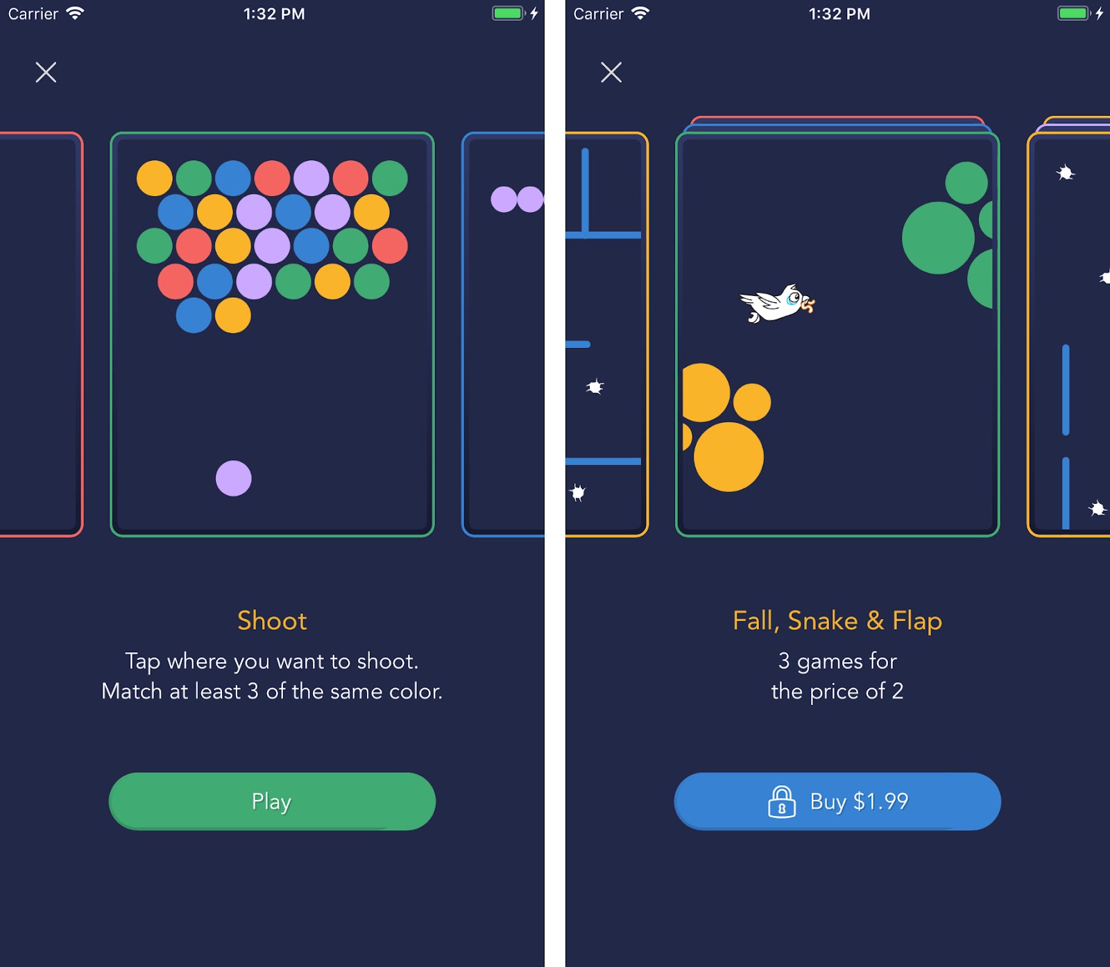
Only one product is presented at the center of the screen, and users can see that there are more products if they scroll left or right. Scrolling horizontally “snaps” new product to the center, and after that, texts and buttons below change appropriately. Users can also tap on one of the partially shown products, which would set it to the center.
What had to be done to achieve that? We’ll make a simple project together, to figure it out. The project can be downloaded from this link.
Note: this tutorial is for developers who already have experience with autolayot and collection views. We will not cover every step in detail. For beginner’s tutorials, I recommend starting from Ray Wenderlich tutorials.After creating a new project, you get one view controller (of the class ViewController) in the Storyboard. For this demo, we will use that one.
Step 1 – Storyboard settings
Things we are going to add to the Storyboard: 1 collection view, 1 label, and 1 image view in the collection view cell.Collection view setup
- Add trailing and leading constraints (0), vertical centering in superview, and set its height to be half of the superview size

- We used the light gray background to make it visible in the Storyboard for purposes of this tutorial. We will change that in the code later.
- Set ViewController to be the data source and delegate for the collection view.

Cell setup
- Set cell identifier to ProductCell.
- Add image view, with top and bottom constraints (0), and leading and trailing (10) to make the space between products.
- Set content mode to Aspect fill to avoid the disproportionate image scaling, and check “Clips to bounds” to cut out the parts of the image that span outside of the image view.
- We also need to create a custom class for the cell and connect the image view as an outlet. So, let’s add a new class to our project, with the name of ProductCollectionViewCell, whose superclass is UICollectionViewCell. Then just set ProductCollectionViewCell as the class of the cell in Storyboard.

Label setup
- Set label’s top, leading and trailing constraints to 30.
- Set label’s text alignment to center.
That’s it – done with storyboard settings!
Step 2 – Data source
This part is really easy – like in every table view or collection view you ever used. We need to load data and implement UITableViewDataSource required methods.We used the same names and screenshots for games as in Early Game Alarm. You can download our assets from here, or use your own.
// ViewController.m

- (void)viewDidLoad {
   [super viewDidLoad];
   self.productNames = @[@"catch", @"memory", @"shoot", @"fall", @"snake", @"flap", @"tennis", @"tetris", @"traps"];
   self.collectionView.backgroundColor = UIColor.clearColor; // Remove the background
}

- (NSInteger)collectionView:(UICollectionView *)collectionView numberOfItemsInSection:(NSInteger)section {
   return self.productNames.count;
}

- (UICollectionViewCell *)collectionView:(UICollectionView *)collectionView cellForItemAtIndexPath:(NSIndexPath *)indexPath {
   ProductCollectionViewCell *cell = [collectionView dequeueReusableCellWithReuseIdentifier:@"ProductCell" forIndexPath:indexPath];

   if (cell == nil) {
       cell = [[ProductCollectionViewCell alloc] init];
   }
   cell.productImageView.image = [UIImage imageNamed:self.productNames[indexPath.row]];

   return cell;
}
If we build and run it, we’ll get something like this:

Not really what we wanted, but it was expected. We haven’t specified anything about scrolling, item sizing or layout orientation. Now let’s start paging!
Step 3 – Paging
a) Defining the custom layout
First, we need to create a new class, let’s say PagingLayout, whose superclass is UICollectionViewFlowLayout. That custom layout should define insets, offsets, item sizes, and scroll direction. Then, we need to make sure that our collection view uses that layout.
// PagingLayout.h

@interface PagingLayout : UICollectionViewFlowLayout
+ (PagingLayout *)layoutConfiguredWithCollectionView:(UICollectionView *)collectionView
                                            itemSize:(CGSize)itemSize;
@end
// PagingLayout.m
+ (PagingLayout *)layoutConfiguredWithCollectionView:(UICollectionView *)collectionView
itemSize:(CGSize)itemSize {
PagingLayout *layout = [PagingLayout new]; // Create new layout
collectionView.collectionViewLayout = layout; // Set given collection view to use it
layout.scrollDirection = UICollectionViewScrollDirectionHorizontal;
layout.minimumLineSpacing = 0;
layout.itemSize = itemSize; // Set item size
layout.collectionView.decelerationRate = UIScrollViewDecelerationRateFast;
layout.sectionInset = UIEdgeInsetsZero;
CGFloat inset = (collectionView.bounds.size.width - itemSize.width) / 2;
// Add leading and trailing inset so the first and the last item appear centered on the screen.
collectionView.contentInset = UIEdgeInsetsMake(0, inset, 0, inset);
collectionView.contentOffset = CGPointMake(-inset, 0); // Adjust initial insets
collectionView.showsHorizontalScrollIndicator = NO;
return layout;
}// ViewController.m
- (void)viewDidLoad {
[super viewDidLoad];
// 1. Setting up collection view and its data source
self.productNames = @[@"catch", @"memory", @"shoot", @"fall", @"snake", @"flap", @"tennis", @"tetris", @"traps"];
self.collectionView.backgroundColor = UIColor.clearColor; // Remove the background collor
// 2. Paging
[self.view layoutIfNeeded]; // Just making sure we will get appropriate sizes for collection view bounds
CGFloat height = floor(self.view.frame.size.height * 0.5); // Collection view height
self.cellSize = CGSizeMake(height * 0.8, height); // Calculate image dimensions
// In this case we are setting cell width to be height * 0.8
// Finally, initialize Paging layout and assign it to our colleciton view
self.collectionViewLayout = [PagingLayout layoutConfiguredWithCollectionView:self.collectionView itemSize:self.cellSize];
}After building and running, we should have something like this: horizontal scroll view, with images of appropriate size.

b) Snap-to-center
However, still it doesn’t behave the way we wanted it. To achieve the paging functionality, we should implement the function:- (CGPoint)targetContentOffsetForProposedContentOffset:(CGPoint)proposedContentOffset
withScrollingVelocity:(CGPoint)velocity;Which according to the docs “is used to return a point at which to rest after scrolling – for layouts that want snap-to-point scrolling behavior”. With the help of this article, we wrote this code that does some sort of the magic.
// PagingLayout.m

#pragma mark - UICollectionViewLayout (UISubclassingHooks)
- (CGPoint)targetContentOffsetForProposedContentOffset:(CGPoint)proposedContentOffset withScrollingVelocity:(CGPoint)velocity {
    CGSize collectionViewSize = self.collectionView.bounds.size;
    CGFloat proposedContentOffsetCenterX = proposedContentOffset.x + collectionViewSize.width / 2;
    CGRect proposedRect = CGRectMake(proposedContentOffset.x, 0, collectionViewSize.width, collectionViewSize.height);
    UICollectionViewLayoutAttributes *candidateAttributes;
    for (UICollectionViewLayoutAttributes *attributes in [self layoutAttributesForElementsInRect:proposedRect]) {
        if (attributes.representedElementCategory != UICollectionElementCategoryCell) {
            continue; // Skip if they are not related to our cell.
        }
        if (!candidateAttributes) {
            candidateAttributes = attributes;
            continue;
        }
        if (fabs(attributes.center.x - proposedContentOffsetCenterX) < fabs(candidateAttributes.center.x - proposedContentOffsetCenterX)) {
            candidateAttributes = attributes;
        }
    }

    proposedContentOffset.x = candidateAttributes.center.x - collectionViewSize.width / 2;
    CGFloat offset = proposedContentOffset.x - self.collectionView.contentOffset.x;
    if ((velocity.x < 0 && offset > 0) || (velocity.x > 0 && offset < 0)) {
        CGFloat pageWidth = self.itemSize.width + self.minimumLineSpacing;
        proposedContentOffset.x += velocity.x > 0 ? pageWidth : -pageWidth;
    }

    return proposedContentOffset;
}
c) Interactions & updates
Now we got pages all right, but the text on the label does not match the image shown. So let’s make a couple of helper functions. The first one to get the current page, and the second one to update the label text. To get current page, we should divide the total content offset with the “page” width.
// ViewController.m

- (int)getCurrentPage {
    CGFloat pageWidth = self.cellSize.width + self.collectionViewLayout.minimumLineSpacing;
    CGFloat contentOffset = self.collectionView.contentOffset.x + self.collectionView.contentInset.left;

    return round(contentOffset / pageWidth);
}

- (void)changeText:(long)currentPage {
    self.nameLabel.text = [self.productNames[currentPage] capitalizedString];
}// ViewController.m
- (void)scrollViewDidEndDecelerating:(UIScrollView *)scrollView {
[self changeText:[self getCurrentPage]];
}
- (void)collectionView:(UICollectionView *)collectionView didSelectItemAtIndexPath:(NSIndexPath *)indexPath {
int currentPage = [self getCurrentPage];
if (currentPage != indexPath.row) {
CGPoint offset = CGPointMake(- self.collectionView.contentInset.left + indexPath.row * self.cellSize.width, 0);
[self.collectionView setContentOffset:offset animated:YES];
[self changeText:indexPath.row];
}
else {
// Do something else when user taps on the cell in center...
}
}// ViewController.m
// in viewDidLoad
[self changeText:0];
d) Start from the n-th one
To start displaying products from the second, third or any other item, we need to change the initial content offset of the collection view and to set the correct initial text. Let’s make another helper function.// ViewController.m
- (void)initialOffset:(int)n {
self.collectionView.contentOffset = CGPointMake(- self.collectionView.contentInset.left + n * self.cellSize.width, 0);
[self changeText:n];
}
Step 4 – Making it pretty and shiny (bonus)
Now, the last step is to make it fancy. You can play with fonts, text, background colors; add more views, shadows, etc. To set the image border and corner radius just like we did in the Early app, you can add this code to the ProductCollectionViewCell:
// ProductCollectionViewCell.m

- (void)awakeFromNib {
    [super awakeFromNib];
    self.productImageView.layer.borderColor = [UIColor colorWithRed:69/255.0 green:170/255.0 blue:117/255.0 alpha:1.0].CGColor;
    self.productImageView.layer.borderWidth = 4;
    self.productImageView.layer.cornerRadius = 10;
}
This is how our finished project will look like.


Your Amazon store needs a partner
We build and grow your Shopify DTC business together with Amazon.
Find out how to own your audience and not depend only on Amazon high fees.

Author: Dusan Popovic

Best Amazon FBA course 2026

Connect Shopify to Amazon: Complete 2026 guide

C2B e-commerce


