How We Made Cut Expenses Lite More Accessible
The story behind the makeover
Last fall, after two years of developing apps in Objective-C, I decided to start learning Swift. My opinion is that the best way to learn something is to actually code; to work on “real project.” And by that, I don’t think you should begin with enterprise projects for real clients. But it’s good to come up with realistic test projects, on which you’ll be confronted with all sorts of real-life problems. Also, if the project is something you find interesting, it will motivate you to do more. My company, Byteout, supports that approach, and I got the green light to find a project and start implementing it.
My goals at that time were:
- learning Swift;
- writing app extensions and sharing code between it and the main app;
- learning how to make more accessible apps.
I chose to rewrite one of our old apps – Cut Expenses Lite. As the name suggests, its main goal is to help users track how they spend their money. It was on the App Store since 2010 (even before I came to the company), and even though it was old and looked really outdated, it still had traction; it had at least a couple of downloads each month. This is how it looked like (in June 2018):
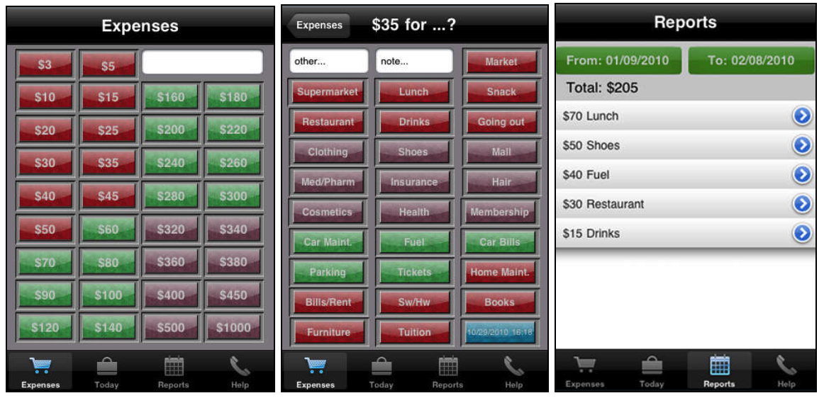
One thing that caught my attention was that it looked nothing like the other expenses tracking apps. At the first look, the interface seemed so cluttered. However, after the first use, I realized that its main feature was really cool – users didn’t have to input the exact number, just to choose the approximate amount. It actually had a really simple way of logging expenses – in just two taps.
From the educational point of view, it had everything I should cover as a beginner in Swift: CollectionViews, TableViews, NavigationControllers, TabBars, DatePickers, CoreData, etc.
Rewriting this app felt like a great idea: benefits for me, company, and users who stayed with us over the years.
So even though I thought (and still think) that it needed some UX improvements (like better way of organizing categories, simplified filtering, and nice charts to accompany the reports), I decided to leave it the way it was (for the time being) and just give it a fresh, new, material design makeover. After some time I achieved this:
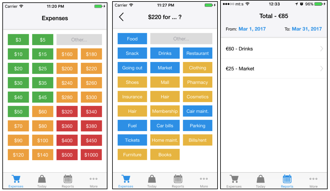
And I added Today Extension for a quick overview of expenses. I checked almost all the tasks from my “to learn” list. Only accessibility remained. By that time, I’ve read a lot on the subject. However, I still never have thought about that while making the apps. I wasn’t really sure how much work will it require, where to begin, nor how the screen readers are actually used.
Accessibility improvements
One major idea of this post (besides bragging about new redesign) is to share my experience, my “learning curve” with the rest of you who are interested in what could be done to make your apps available and usable for more people.
Familiarizing with VoiceOver
As mentioned before, I had no idea how people use VoiceOver until WWDC 2016. At that conference, participants had the opportunity to schedule “one-on-one” meetings with Apple experts in different areas (App Store, marketing, UX,… and accessibility). There I had a chance to talk to people who have to use VoiceOver to interact with the apps. It was eye-opening, to see in person what problems they had, and what their experience with apps was like. One of them even turned on VoiceOver on my iPhone to demonstrate something and we forgot to turn it off at the end of the meeting. Once my phone rang, I couldn’t answer it. I was trying to get out of that mode for a good 30 minutes. But it was a very useful experience.
For those of you planning to go to WWDC 19, I recommend scheduling these types of meetings. For the rest of you, I can recommend trying to find blog posts or videos on how people use VoiceOver. And definitely try it yourself.
Recommended literature:
Accessibility on iOS and how to test it
Once you truly understand what it’s like to use VoiceOver, you can start with development stuff. Learn about accessibility elements: labels, values, traits, hints and how to use them. The concepts and coding parts are very simple. Probably the most difficult is creating useful labels and hints – coming up with the right copies.
For me, once I figured out how the apps are used with VoiceOver, it was all much easier.
Recommended literature:
- Understanding accessibility on iOS
- Crafting useful labels and hints
- iOS accessibility best practices
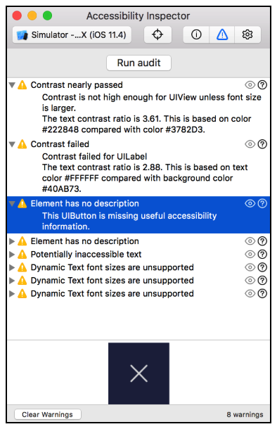
Even though I highly recommend testing your app on a real device with VoiceOver enabled before the release, that could be slow during the development. Luckily, there’s a great tool that comes with XCode – Accessibility inspector (XCode > Open Developer Tools > Accessibility Inspector). It can reveal problems with inaccessible elements just by hovering the simulator screen and has this cool audit feature that shows you all sorts of warnings, and how to fix them.
Recommended literature:
Fixing accessibility in Cut Expenses Lite
Ok, so I explained our app and gave you tips on accessibility on iOS and where to read more. Let’s see what we had to do in the code to make the app more accessible.
As I used the native UI components for almost everything, even without any improvements, most parts of the app were fully functional with the VoiceOver. As Apple would say, you get a bunch of this stuff for free. Tab bar was completely usable, as well as page titles. There were just a couple of tiny problems. I’ll illustrate them using the Accessibility Inspector.
1. Buttons without labels
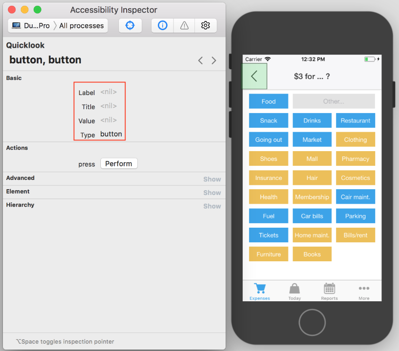
In Accessibility Inspector we can see that a lot of information is missing. That was the first clue to check how it sounds with VoiceOver. And it sounds:
“Button”.
This is to be expected since we used only an image for the button and no text. However, this is a big problem for users who cannot see the image. What does this button do? Why should they tap it? Things like this make the app unusable. We can fix it, luckily, with just one line of code:
button.accessibilityValue = "Back"
With that changes the VoiceOver says:
“Back; button”
2. Punctuation
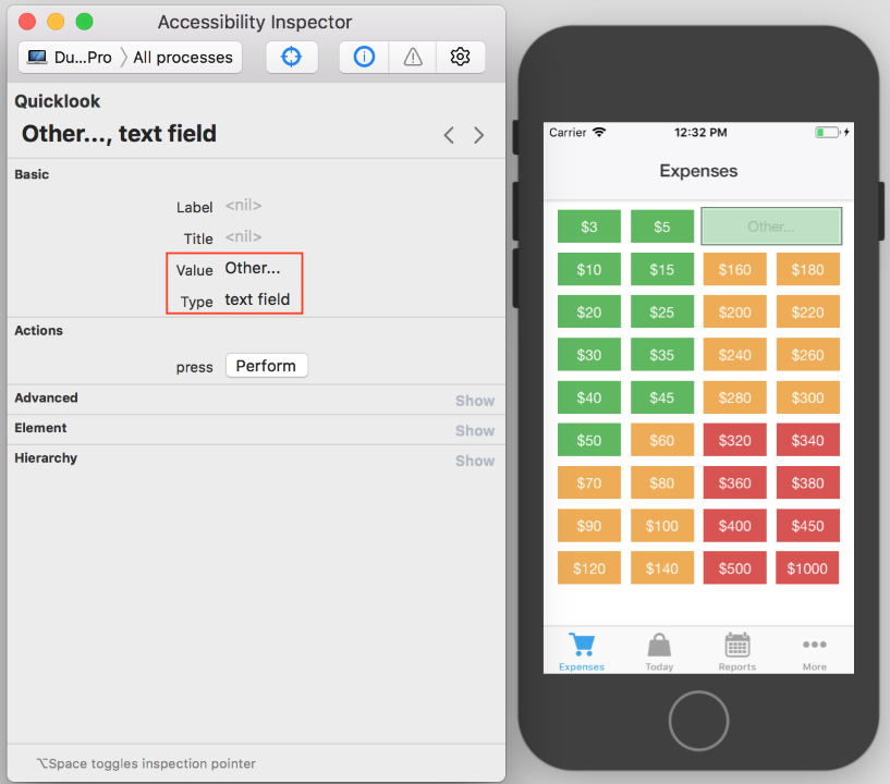
How this sounds with VoiceOver:
“Other; ellipsis; textfield; double tap to edit”.
Ellipses look good in UI visually, but they shouldn’t be spoken. We can fix that with just one line of code:
myInput.accessibilityValue = "Other"
With that change, the VoiceOver says:
“Other; textfield; double tap to edit”
This is a great example of why you should always try your app with VoiceOver on the real device. When you look at the Accessibility Inspector and see punctuation marks, you don’t expect them to be spoken. It’s something easy to overlook when you just rely on your eyes. The accessibility text looks exactly like the test on the control and you assume that there are no problems.
3. Action indication – Accessibility traits
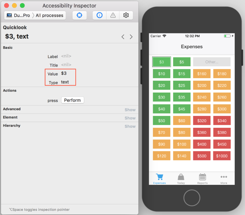
How this sounds with VoiceOver:
“Three dollars”.
Even though this looks correct, it does not indicate that the cell could be tapped. For users who are for the first time in the app, and cannot see the interface, it is not very intuitive. To fix it, we can add something like this:
cell.isAccessibilityElement = true
cell.accessibilityLabel = cell.label.text
cell.accessibilityTraits = UIAccessibilityTraitButton
With those changes, the VoiceOver says:
“Three dollars; button”.
That indicates that the cell can be tapped to perform some action. Very subtle, but meaningful difference.
4. Hints
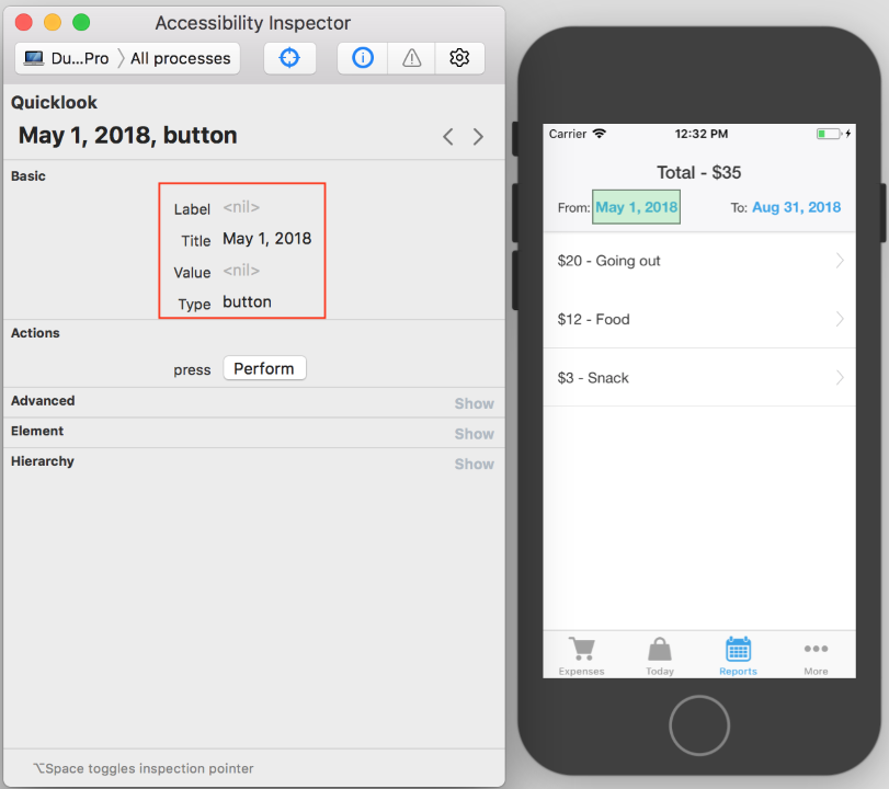
How this sounds with VoiceOver:
“May first two thousand eighteen; button”.
This is correct, but it could be even better if we added a hint with additional explanation; like this:
fromControl.accessibilityHint = "Opens calendar picker"
Now, this depends on VoiceOver verbosity settings. Some people will have hints turned off. But for others, VoiceOver will read our button like this:
“May first two thousand eighteen; button; opens calendar picker”.
5. Text improvements – cells
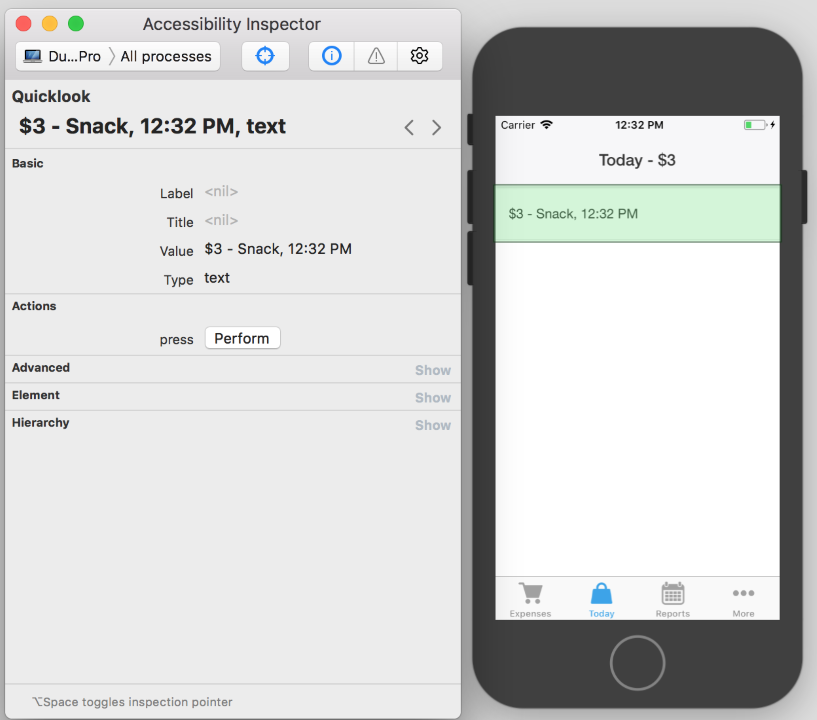
How this sounds with VoiceOver:
“Three dollars; snack; twelve thirty-two P M”.
Not so bad, but it can be even better.
cell.isAccessibilityElement = true
cell.accessibilityLabel = "\(getCurrencySymbol())\(amount) for \(category), at \(dateString)"
By adding just two tiny words “for” and “at”, we now get it to sound more like a sentence and less as disconnected parts of information:
“Three dollars for snack, at twelve thirty-two P M”.
Ok, to be honest, we could achieve the same behavior if we just used this as the label text instead of accessibility label; it wouldn’t visually change the interface that much in this particular case.
6. Text improvements – titles & subtitles
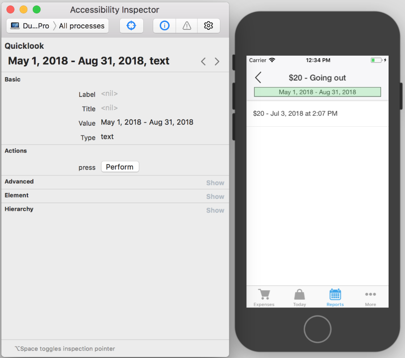
How the title and subtitle sound with VoiceOver:
“Twenty dollars; going out”. “May first two thousand eighteen; August thirty first two thousand eighteen”.
Again, let’s make it sound more complete.
pageTitle.accessibilityLabel = "\(getCurrencySymbol())\(total) for \(category)"
subtitle.accessibilityLabel = "From \(from) to \(to)"
With those changes, the VoiceOver says:
“Twenty dollars for going out”. “From May first two thousand eighteen to August thirty-first two thousand eighteen”.
Conclusion
I had to add about 20 lines of code through the entire app, to make it totally usable with VoiceOver. The only real problems were the back button and ellipsis. The rest were just subtle improvements. And everything else was already there, just by using the default controls. There was not much effort required at all in order to enable more people to use our app (without frustrations).
I am aware that it still needs some improvements (UX, contrasts, better support for larger fonts), but it is a start.
And to end this article quoting Apple: “It’s the right thing to do.”

Best Amazon FBA course: Top picks for 2025

Connect Shopify to Amazon: Step-by-step in 2025
C2B e-commerce