
How to Build More Accessible Apps for Android
One of Google’s core principles is to focus on the user, and all else will follow. The Google User Experience (UX) team believes that usability and accessibility go together. That’s why Google developed Android Accessibility Suite, which contains useful tools for people with disabilities.
Android Accessibility Suite contains:
-
Select to speak – point your camera at an image or select something on your screen to hear the description spoken.
-
Accessibility menu – the large on-screen menu that provides basic functionality (volume control, screenshot, etc.).
-
TalkBack – helps vision-impaired users to interact with their phone. It uses audio and vibration to let users know what is happening on the screen, and what actions they can take.
-
SwitchAccess – users can interact with their phone using a switch (external switch, buttons on device, etc.).
Google also developed an Accessibility Scanner app, which you can use to easily take screenshots of your app and tell you what accessibility guidelines you violated and gives you a recommendation on what to change. Also, you can achieve the same thing going through the accessibility section of your app’s pre-launch report on Google Play Console.
What you can do to make Android App Accessible
Content labels
All views that are used for interaction should have content labels that describe the purpose or action associated with that View. If you don’t pay attention to content labels, visual-impaired users will hear only ‘Button 15 Unlabeled, Button 74 Unlabeled, Button 54 Unlabeled’ and so on and on. That’s why labeling is essential.
List of next attributes will help you with that-
android:contentDescription – it provides labels for the views, so it defines what TalkBack will read about that view.
-
android:hint is used for EditText instead of android:contentDescription so that users can understand what is expected to be filled. When EditText is filled, the filled text is read by TalkBack, not the hint.
- android:labelFor – references id of another View and provides a content label for that View.

Google’s best practices for labeling content can be summarized as:
-
Keep content brief since users with Braille displays are limited to 40 character lines.
-
Don’t include words that tell users how to physically interact (tap, press, etc.) in the content description. Accessibility Service will take care of that. After all, Switch Access or Voice Over users don’t have any physical interaction with the screen.
-
Have the most important information come first so that users can decide if they will listen to it all or skip it quickly.
The text in TextView is automatically provided to accessibility services, so content labels are unnecessary.
Decorative images do not require content labels. For them it is the best option to put android:contentDescirption = “@null” or android:importantForAccesibility= “no”. Although, sometimes accessibility service can decide to ignore android:importantForAccesibility, so it is better to use android:contentDesciption = “@null”.Touch targets:
Any screen element that the user can interact with should be large enough for reliable interaction. Unreliable interaction with UI elements can lead to behavior that is not intended by the user and, therefore, to disastrous user experience.
Accessibility guidelines state that all touch targets should not be smaller than 48dp x 48dp. Which means that the next statements need to be true:
-
android:paddingLeft + android:minWidth + android:paddingRight >= 48dp
-
android:paddingTop + android:maxWidth + android:paddingBottom >= 48dp
The padding values allow an object’s visible size to be less than 48dp x 48dp while still having the recommended touch target size.
Duplication
Duplicate clickable views
When you implement onClickListener and OnLongClickListener, check if the View has some descendants that are clickable and share the same on-screen location. If there are more nested views that are clickable and are on the same location, accessibility service may not explain actions adequately to the users. When you have more interactions with a single view, it can be very hard for users to interact with it or for SwitchAccess to represent possible actions.
Duplicate description
Pay close attention when layouts are reused like RecyclerView and ListView. Make sure that text labels for repeated content have an additional description. If there are multiple delete buttons, make sure that they are not labeled as delete but as, e.g., Delete item 8.
Focus order
Controlling focus order
When users navigate in any direction using directional controls, the focus is passed from one element (view) to another, as determined by the focus order. This order is based on an algorithm that finds the nearest neighbor in a given direction. In rare cases, the algorithm may not match the order that you intended or may not be logical for users. In these situations, you can provide explicit overrides to the ordering using the following XML attributes in your layout file: android:nextFocusUp, android:nextFocusDown, android:nextFocusLeft, android:nextFocusRight.
But you should be aware that if the referenced view does not exist or is part of a hierarchy that is invisible, because a RuntimeException will happen when the reference is accessed.
Interrupting focus order
android:accessibilityLiveRegion – gives instructions whenever the user will be notified when that view changes. Values are “none”, “polite” and “assertive”. If you assign “polite”, TalkBack won’t interrupt anything it may be already announcing. If you assign “assertive”, TalkBack will interrupt ongoing speech to announce changes to this view immediately. It is strongly encouraged to avoid “assertive” live regions.
Carefully consider when to use live regions, since frequently changing announcements can be disruptive. Also, Google warns developers to be careful not to overuse live regions since they are the exception, not the rule. Custom viewsUse native elements, since non-standard elements require an extra implementation to work well with accessibility services. Nevertheless, if a custom view is absolutely necessary, you need to make it accessible. If you don’t, accessibility services like TalkBack will skip it entirely, severely degrading the user experience.
Here are some APIs for making custom views accessible:
-
Android provides the AccessibilityNodeProvider class, which helps you expose virtual view hierarchy and allow for the exploration and control of subcomponents.
-
The ExploreByTouchHelper class helps with support in custom views that represent a collection of view-like logical items, and it simplifies many aspects of providing information to accessibility services and managing accessibility focus.
-
The AccessibilityDelegate class targets widget developers who extend basic views and want their applications to be backward compatible.

New attributes introduced in Android P (for API level 28 and higher)
-
android:screenReaderFocusable – can be true or false. The default value is false, allowing the screen reader to consider other parameters, such are focusability or presence of a text, to decide what to focus. If the value is set to true, the screen reader will focus this view regardless of other parameters.
-
android:accessibilityTraversalAfter – sets the id of a view which will be focused next. For example, if view B is set to be after view A, then a screen-reader will go through the entire content of A before going through the entire content of B.
-
android:accessibilityTraversalBefore – sets the id of a view which will be focused after the screen reader is done with this view.
-
android:accessibilityPaneTitle – whenever or not, this view is a pane title for accessibility purposes. If a pane has accessibility pane title, accessibility services have more detailed information when pane changes.
-
android:accessibilityHeading – whenever or not this view is heading for accessibility purposes. By adding these heading, you allow accessibility services to help users navigate directly from one heading to the next.
How will Jetpack Compose change Accessibility?
Jetpack Compose introduces a whole new way of making UIs. In Jetpack Compose, Google introduced a new way of declarative UI implementation. It has many similarities with Flutter. Unfortunately, you cannot find any guidelines for Accessibility with Jetpack Compose, but after some research, probably something like SemanticsProperties and SemanticsAction will take care of labeling, etc.
At the moment of writing this article, Jetpack Compose is not yet production-ready, and neither are the above-mentioned classes, so we will not go into further details. But stay tuned for upcoming detailed analysis of Accessibility in Android with Jetpack Compose.
Best Amazon FBA course: Top picks for 2025

Connect Shopify to Amazon: Step-by-step in 2025
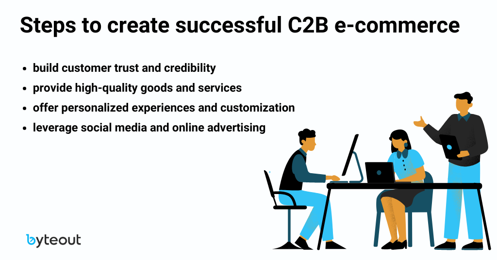
C2B e-commerce

