Call to action (CTA) is a marketing term for any element, usually a button, that engages visitors to take immediate action. E-commerce call to action tells visitors what to do, where they should click, and what to purchase. CTA is an action phrase or a command on a website that leads the consumer to the next step of a sales funnel or process, such as ‘Sign Up’ or ‘Buy Now’. It generally takes the form of a button or hyperlink. There’s no definitive solution on which button, phrase, design, or size works best, so testing and enhancing the e-commerce call to action is vital for increasing sales.
Why is a call to action important? #
The e-commerce call to action is crucial for a website/landing page. Psychology is behind everything we do. You’re entering a person’s inner psychology when you create a CTA on a website/landing page. Without a clear CTA, the user may not know the following steps and will likely leave the website.
CTAs can help you guide your visitors through the buying process and can increase conversion rates or decrease them if not done right. Making a compelling e-commerce call to action is more challenging than it seems, and it will do wonders at drawing visitors’ attention and guiding them through the process.
The human mind is so used to how the online world works that they expect to see a CTA in the right position on your website/landing page. That, however, doesn’t mean they’re prepared to follow your instruction and convert. Making effective CTAs takes work, but following proven techniques can bring you success.
E-commerce call to action guide #
The best way to create a CTA button is to follow these instructions:
- Mind-blowing design. CTAs need to stand out and make an impact. It shouldn’t blend in with the rest of your web page design. You should always match CTA to your brand colors and design but make sure the final CTA is eye-catching. The psychology of colors is really important as well.
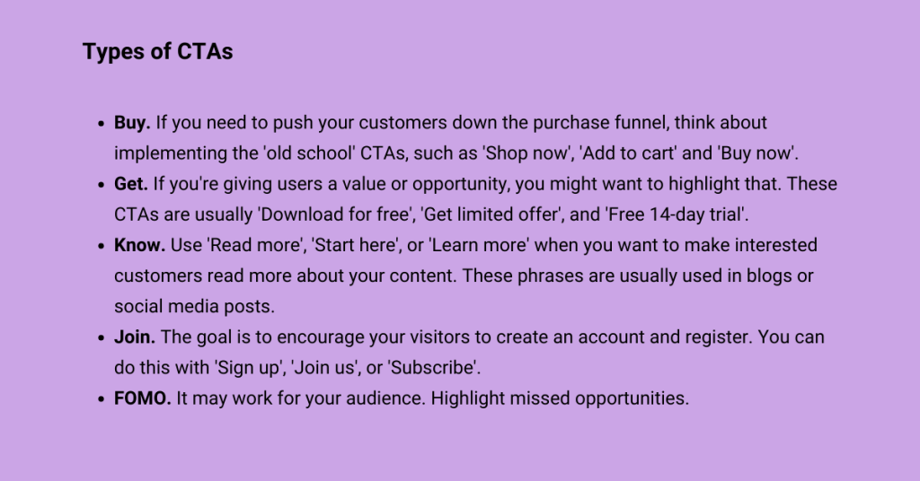
- Action-focused copy. As its name implies, a CTA is designed to make the user take action, so a compelling CTA should use action words such as ‘sign-up’, ‘learn more’, and ‘buy now’. But remember to be creative. Explore leading brand websites to see what kind of actionable copy they use.
- Sense of urgency. Adding the element of urgency is one of the best ways to keep your visitors focused on the action you want them to take. Users are easily distracted on the internet, so a strong sense of urgency, such as a ‘limited time offer’ can help compel users to take action immediately.
- Be honest. Keep your CTAs informative and ensure the copy tells your customers what they should expect in exchange for their clicks. Stating a clear benefit the user will get from completing the transaction is an effective way to get them to click.
- Be effective. The conversion path should be a smooth and logical flow. It’s essential to align your CTAs with specific stages in the process cycle to make relevant offers.
- Less is more. A good call to action should be a short phrase, not a sentence. Most are no longer than five to seven words.

How to create an engaging Call To Action in e-commerce #
The online store should be clear and transparent to engage customers into a shopping mood. In order to boost e-commerce sales, certain elements should attract the most attention, the message should be clear, and the products should act as a “great deal.”
In most cases, doubling the conversion rate is a more realistic proposal than doubling the website search engine traffic, and it all starts with creating a convincing e-commerce Call to Action. Here are essential features of an engaging Call to Action.
Urgency increases conversion rate #
When customers feel an opportunity is limited, they might be more likely to buy. For instance, if a Call to Action includes a line of copy that says “Buy now – only on sale up until midnight,” the visitors are more likely to turn into customers because they feel they might miss a good purchasing opportunity.
Testing different color scheme maximizes the result #
An engaging e-commerce call to action should not merge with website design but should be evident and conspicuous.
While no conclusive color converts best, it is essential to guarantee that e-commerce Call to Action has the color palette that resonates with the buyer persona and the brand. It’s great to make sure that CTA looks like a button and not just text. Many information and research studies reveal that buttons function well for routing site visitors to the checkout process. In practice, the following three colors of the CTA button have shown the best conversion rate:
- Red: The most eye-catching color that stands out on most web pages
- Green: Calming color associated with “Go” is a motivator for many customers
- Orange or Yellow: Orange awakes an exciting and warm feel
A clear message within the CTA is vital for conversions #
Ensure the Call to Action button communicates what precisely happens if it’s clicked on. A fuzzy button message cannot force users to take the desired action. If users do not understand what will happen when they click the button, they will not click on it. Vague labels such as “Continue” and “Submit” should be avoided.
The message within the button should be brief also. A simple and most common “buy now” and “add to cart” works well, although some powerful CTA phrases can be significant game-changers for conversion rate and e-commerce sales. It should also be tested in order to find messages that resonate with customers best.
E-commerce Call to Action into the Above The Fold as a proven method #
Above the fold is a term used to define the area of a website, which is visible to the customer at first glance without scrolling. Crucial information along with the CTA should be placed Above the Fold. If online retailers can grab a site visitor’s interest at first peek, opportunities they’ll take the desired action dramatically increase along with the e-commerce sales.
A/B testing of CTA #
You must know your audience before making e-commerce call to action. Every audience responds differently to various calls to action. There is no guarantee that one call to action will outperform another. The best advice you can get is to test, test, test.
The overall success of an e-commerce call to action can be measured via a conversion rate: the number of clicks divided by the number of impressions or times the CTA was seen.
This A/B testing strategy consists of making changes to your website and observing the impact of this change on a segment of users. This method allows you to test your ideas and features with your target audience.
A/B testing your CTA buttons is the best way to improve your website’s user experience, directly affecting the conversion rate.
Here are the different steps you need to follow to A/B test your Call to Action button:
- Define your test’s goal with KPIs. Your goal shouldn’t be to change the color or size of the CTA button. Your goal can be, for example, to increase the number of signed-up users.
- Define the A and B versions. For example, the red ‘Sign up’ button can be your A version, and the blue button can be your B version.
- Run your A/B test .Run a test on a smaller percentage of your entire website audience. |You don’t want to lose potential customers, right?
- Analyze the collected data. Usually, A/B testing takes several weeks before you get reliable results. Carefully observe the collected data.
- Change it or not? Based on the test’s results, change what needs to be changed. Testing should help you get to know your audience.
Summary #
What is an e-commerce call to action? It means exactly that: a call to action. It is an action phrase that tells your visitor what next step to take. It goes into deep psychology.
The phrase matters the most, but the button size, color, and position are very important. An e-commerce call to action doesn’t always have to be in the form of a button, it can be a one-sentence action.
The effective call to action button is a button that has a mind-blowing design and creates a sense of urgency. The e-commerce call to action button should be a part of the logical flow a visitor will follow during a website visit.
There is no recipe for success, so the best advice is to perform A/B testing and check with the target audience what performs well.
Defining an e-commerce call to action is half-art and half-science. The design should be attractive and engaging yet clear and simple at the same time. If online retailers follow the tactics we discussed in this article, they’ll be better positioned to make the visitors act on web pages.
Do you want to learn more about e-commerce? Continue reading about → Conversion optimization.

