Colors are what make a brand recognizable. Companies carefully choose brand palettes that express their brand’s image. Understanding color psychology is the first step to creating a brand color palette that supports the brand’s values. Taking the right colors to represent a brand increases brand recognition for up to 80% of consumers. For that and many other reasons, businesses use color psychology when creating their logo, website, app, or marketing campaigns.
What is color psychology? #
Color theory gives us practical guidance on color mixing and the visual effects of specific color combinations. Color psychology is part of color theory that studies how colors affect human behavior, mood, and impression of others. It is part science and part art. You can set a mood with colors, draw attention, or make a statement. So let’s dive into color psychology and how to use it to attract your target group and make loyal customers.
How colors affect different groups of people #
Color psychology differs from person to person, but there are common themes that appear. Color psychology can apply to all aspects of our behavior but mainly how we interact with brands and marketing. Mixing and matching various hues can help us explore concepts like color perception and the impact of color combinations. Getting the right combination of colors can mean the difference between a repeat customer and a one-time visitor.
You should always do customer targeting using color psychology. Many marketers study how customers perceive different colors to achieve a successful marketing campaign. Businesses should make specific color choices based on the color preferences of their target audience.
Research has shown different color preferences based on gender, age, and cultural differences:
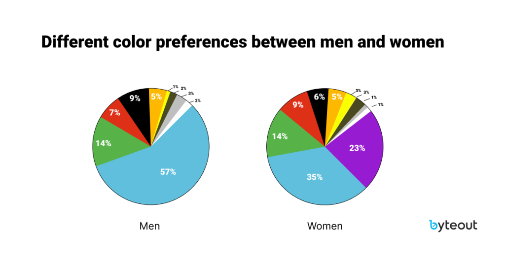
- Gender: Color perception research indicates that men favor bright, contrasting colors while women prefer softer shades. For example, both men and women like the color blue; men dislike the color purple, while women feel the opposite, and brown is generally the least favorite.
- Age: Color preference varies based on age. So, when preparing marketing materials, keep in mind your audience’s age profile. The research found that blue is preferable throughout life. Yellow is preferable in childhood, and preference tends to decline as we age. As people mature, they favor colors of shorter wavelengths (blue, green, violet) rather than colors of longer wavelengths (red, orange, yellow). While younger audiences like energetic and saturated colors, older people often find vibrant colors repulsive. So when designing a product or marketing material for older users, keep that in mind.
- Cultural differences: Besides age and gender, a factor influencing our color preferences is our cultural background. For example, in most Western cultures, the color white is linked with aspiration, innocence, purity, and hope. On the other hand, in many Asian countries, white is associated with bad luck, death, and mourning. It’s crucial for those involved with web and UX design to look at the cultural connotations of the color palettes based on the relevant target audience for the website or product. FUN FACT: in Europe, people wear black for funerals, while in India, they wear white. On the contrary, Europeans wear white to weddings, which is not the case in India, where the wedding color is red.
- Attention to color deficiency: Blue is the safest color for all age ranges, especially those over 70. It could be because most people can see the blue color clearer than any other color, even people with color-vision deficiencies. Almost everyone can see blue, or, more accurately, almost everyone can distinguish blue as a color different from others. Red and green are the colors most affected by color-vision deficiency.
Meaning of colors #
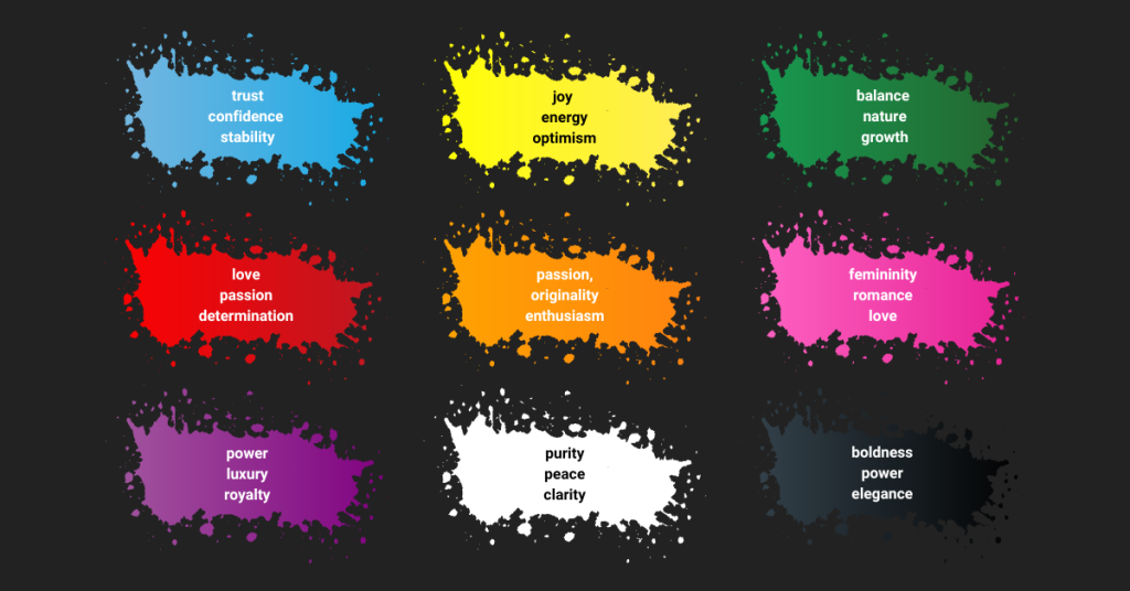
Although there are many differences among different people, generally, there are common effects on customers that each color evokes:
- Blue – trust, confidence, and stability. That is why this is the most common color across the websites.
- Red – deepest emotions like love, passion, and determination. This color is so powerful it can turn potential buyers into lifelong customers if used correctly. Be careful not to overuse it, as that can be overwhelming.
- Green – balance, nature, and growth. Reminds you of dollar bills, right?
- Yellow – joy, energy, optimism. It is a cheerful and playful color that can grab customers’ attention. However, you should use it in moderation because excessive use of yellow can turn customers off.
- Orange – passion, originality, and enthusiasm. Reminds customers of excitement and creativity. Orange paired with cool shades of blue can give off a positive and exciting vibe.
- Pink – femininity, romance, and love. Pink has a soothing effect, so it can be used to offset more aggressive colors like black, orange, and red.
- Purple – power, luxury, royalty. Wise use of this color can convince the customer to make a purchase.
- White – purity, peace, and clarity. White is an essential color on most websites. Always include empty white space around your content so customers don’t feel boxed in.
- Black – boldness, power, and elegance. When used in e-commerce, it sends a confident message to potential customers. Too much black can give off dull surroundings, so you should use it in moderation, along with other tranquil colors.
Since we are talking about color psychology, maybe this photo will make it easier for you to feel their meaning:
How many colors to combine #
When it comes to using colors in the design, make sure to follow color psychology.
Number of colors #
It is important how many colors will be used. Make sure to combine only a few bold colors. Choose a few colors and tend to use a lot of white space with accents of vibrant color to attract the eye to that particular element, usually in the way of a call to action. If you use too many colors, especially those that are too vibrant, you’ll lose hierarchy, with everything fighting for attention.
The golden ration #
It is best to stick to the 60-30-10 rule, a.k.a golden ratio. This rule will help you create color palettes that are well-balanced and visually interesting. The idea is that one color—generally something fairly neutral (either literally or psychologically)—makes up 60% of your brand palette. Another complementary color makes up 30% of the palette. And then, a third color is used as an accent for the remaining 10% of the design. It can also be the first step toward creating a brand palette that is much more forward-thinking than its competitors, thereby setting the brand apart and making it more memorable.
One famous example of this rule is McDonald’s. This rule isn’t set in stone, so feel free to deviate or break it entirely! But it’s always a good starting point. Within these ratios, you can, of course, have shades of color within.
Be careful with the background #
Also, be very careful when combining text colors with the background. The color of the text must be visible against the background. When it comes to text, the best would be to use black, gray, or white on a high-contrast background. It will be easier for users to read than if you put red letters on a green background. Although red and green are contrasting, they are too intensive and tricky to focus on while reading. That is why general advice is to stick to black or white text and a background that will give you a contrast of at least 80 percent.
Smart use of color psychology in e-commerce #
The colors you choose for your e-commerce will have a direct emotional impact on the visitors and buyers on your site. Color psychology has a real impact on our behaviors, and this includes purchasing behavior. When working on your site, your colors should reflect your brand identity, logo, and motivations. Research shows that 42% of shoppers base their opinion of a store only on design, and 52% won’t return to a site due to overall aesthetics.
While using these tactics is a great idea, it’s more than just a color game; several other factors influence shoppers. Besides your color choice, a good e-commerce site’s design is an essential factor for many shoppers. That is why it is important to know who your customers are. When you define your ideal customers, you can use color preferences (like age, gender, and cultural differences) to target them. Combining color with design and powerful call-to-actions gives a complete package. Using design elements like color, power words, and striking visuals to your advantage, you can create an e-commerce site that turns the user into a customer.
Conclusion #
While color psychology is a complex subject, you can quickly learn its basics. From there, designers can build on their knowledge to create more varied and sophisticated color palettes for their designs. Now it’s your turn to use the advice and wisely use color psychology to boost your brand’s profit!
If you need help choosing the colors that will define your brand, contact Byteout and schedule a workshop to help your business stand out.

